
I hadn’t made a poster on a romance one before, but always thought about designing one.
I started by imagining about what could I possibly create, I knew I needed something unique where the poster tells the story, this has and always will be so important in my design career and have always shown this within my work of concept designs.
I use two key principles that lay the foundation of graphic design - storytelling and imagination, those keys lay the foundation upon my creative decision making techniques that I apply within poster design.
Within my work I follow 5 simple steps towards creating the concept poster. I will be going through these steps with you below of how I created the poster 'All I See is Us'. So let me break the 5 points down, to understand what happens within my thought process when I create a graphic poster.
1. Overview - What the concept is (title, genre), why I chose it
2. Inspiration & Research - Mood board images or sketches, colours lighting, other posters
3. Design & Selective Decisions - Images, assets, fonts used and why
4. Mockup & Context - The final poster version including mockups of billboards
5. Final Touches & Reflection - Refinements, fonts adjustment (spacing, contrast, subtitle size), what I learned, what I can take into my next poster design.
1. Overview
The first stage of my thought process is the overview, I am now inside my thoughts, preparing the foundation of my poster design and visualising it within my mindset. This is the planning stage, I decide what I want, the behind the scenes, what genre I want I'll be working on..its like a whole overall birds-eye view of the entire structure of my design process.
Genre: Romance
Description - a couple deeply in love, on a journey, happy, full of excitement
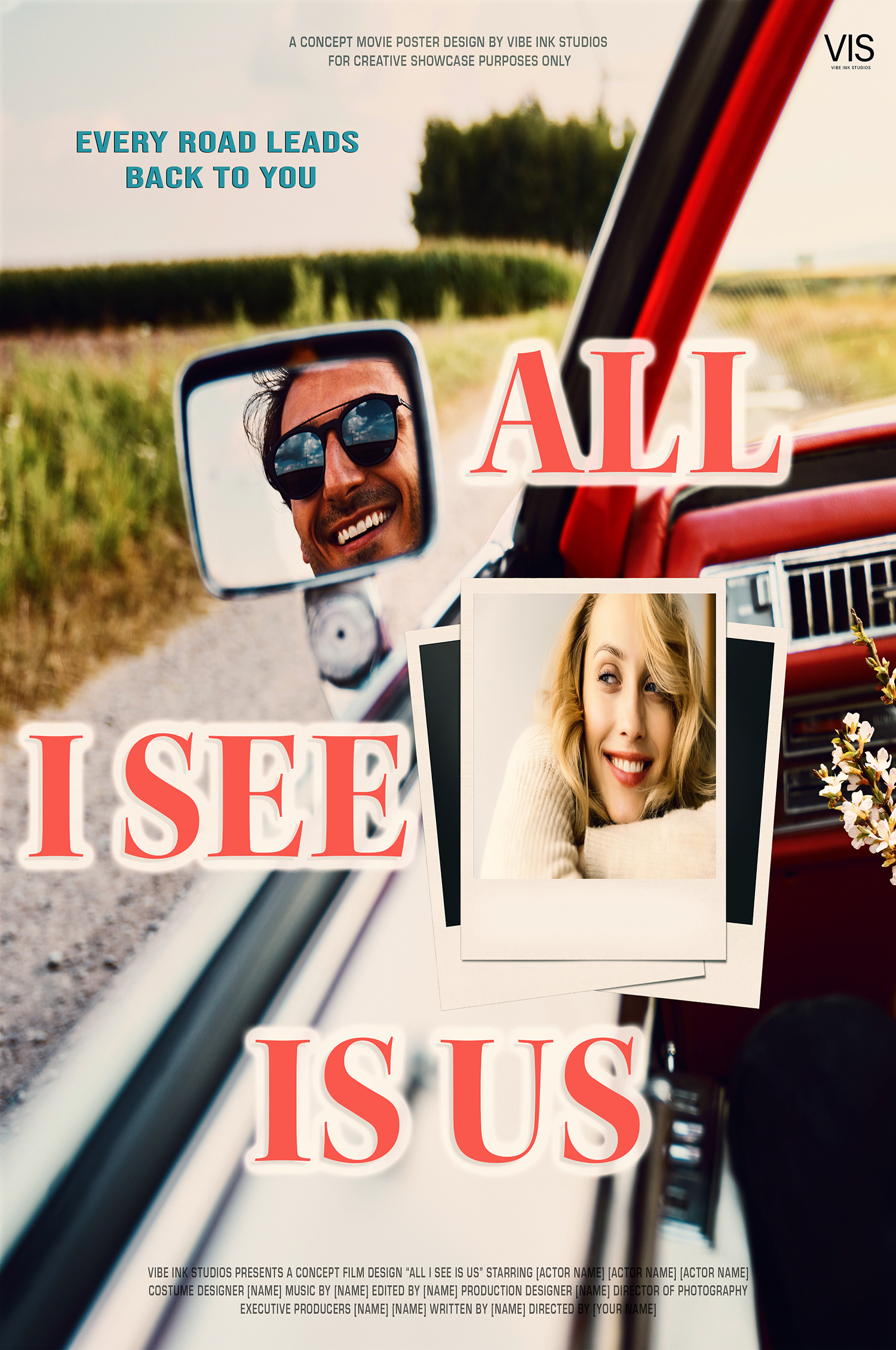
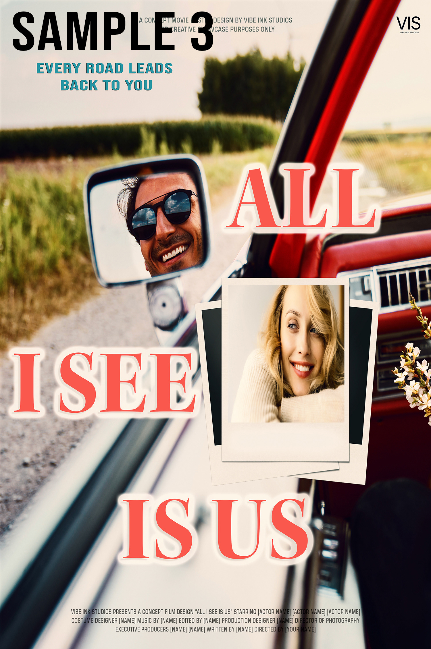
Title - this is where I thought deeply and finally came up with 'All I See is Us' it's about them, saying its all about Us, this felt like the perfect concept for a love story, travelling together, exploring their surroundings, driving a retro convertible classic car, maybe pink or red, something unique, that looks classic. I imagined the setting, somewhere in California, where the sun shines so bright and warm.
I am thinking about the colour grading for the poster...although this is too early for that, but however I enjoy considering it...this stage is all about brainstorming, and I love this step because it's where a concept begins to shape.
2. Inspiration & Research
This is where the fun begins, the stage of inspiration and research, but however, be mindful of what you want, not what other posters look like. Originality is the key to creativity; don't just follow what others have done, be inspired to what you can achieve in your own space of design.
I use Envato a lot, I'm a subscriber, with access to thousands of licensed images, fonts and assets. I also use Adobe Stock, including fonts that integrate directly to my Adobe apps. Having both are important, gives me a strong tool kit for sourcing materials. Without it, it would be harder deciding which images truly support my concept posters.
I started by typing inside Envato's search bar; 'man and woman in love inside car, happy, in love' so many results, this is where I take time to explore, but respecting the clock, but also giving time to what feels right. Having good research, patience and quality of speed by spending it wisely, especially when your on a deadline with a client.
3. Design & Selective Decisions
Then finally something caught my eye...I just knew it was the right one. Maybe your wondering to ask me ...'how do you know when it's right?' For me it's a mix of instinct and detail, the quality of the image, the framing, whether its strong enough to fill the entire poster background. I check the colouring, shade, lighting.
Number of important factors that you have to consider when choosing an image, if the image is very weak...then you know deep down that you will have to spend time to adjusting the image to your requirement, but if you know that's the perfect one...then you have a good feeling about it, I believe follow your emotions when deciding on a image, don't just rush it to make a decision, just think over it and observe it, because that decision you take is just as important as the final piece of your creativity.
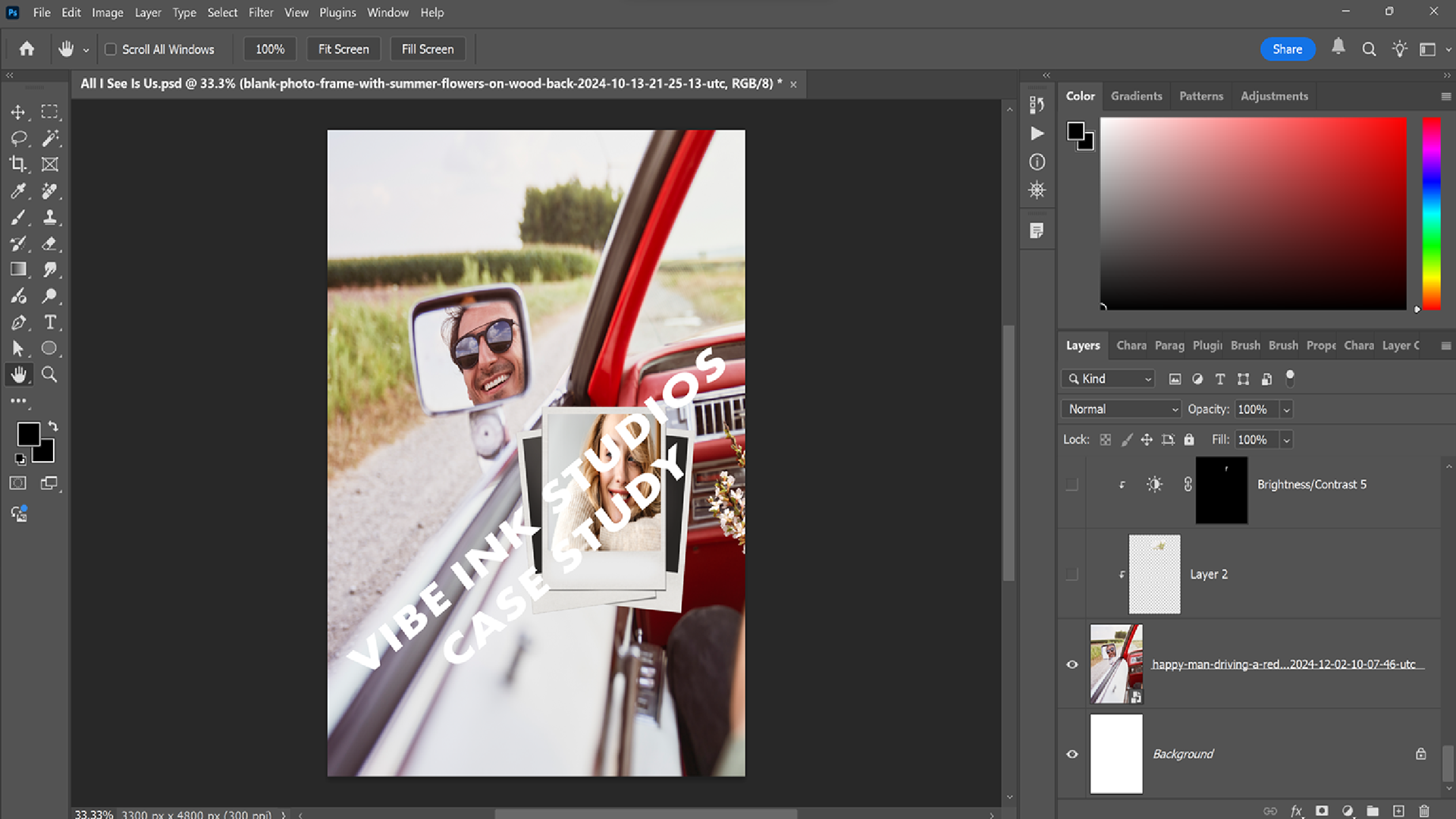
The image that you see below is the image that I selected for my poster. It immediately felt like the perfect fit, the background, the lighting, the soft weather tones and its surroundings, everything worked. I could already see how colour grading will push it further.
The interior of the classic car, added the subtle retro touch, and set the right vibe for the concept layer. The man in the wing mirror was exactly how I pictured him, confident and relaxed, smiling, with his sunglasses added the cool appearance of the character.
The next step, was finding the right woman for this concept, I imagined a blonde, someone with a warm smile that matched the same energy as the man, someone who felt like they belonged together. I searched for 'blonde woman beautiful smile', and browsed through many images until I found her. She looked relaxed in her sweater, her lipstick matched the tone of the car's interior, and above all her smile gave a natural warmth that tied the concept together.
Then came the question of the image placement. Got me thinking should I blend her into the sky? Having her maybe rest her arms upon the door of the car...none of those felt feel right, I just needed to find a way to secure the image within.
Looking at the man in the wing mirror sparked another idea, what if I can place the woman into a mockup of the polaroid? It would give the composition a nostalgic touch.
I searched 'Polaroid mockup' and eventually found the perfect one, with delicate flowers that were included, it was the perfect combination.
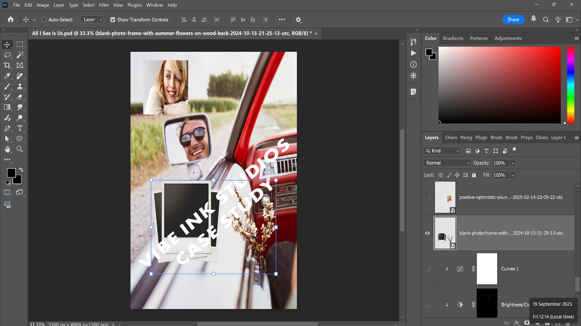
With the polaroid chosen, I positioned it toward the right side of the frame. The objective was to keep the viewer's focus on the couple rather than the flowers, so allowed some of the floral detail to remain and cropped the rest out of the view.
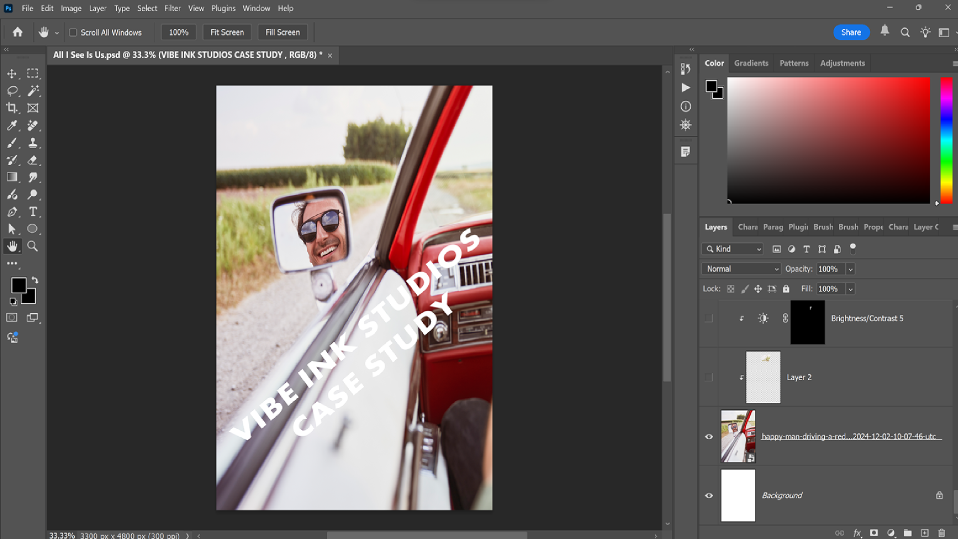
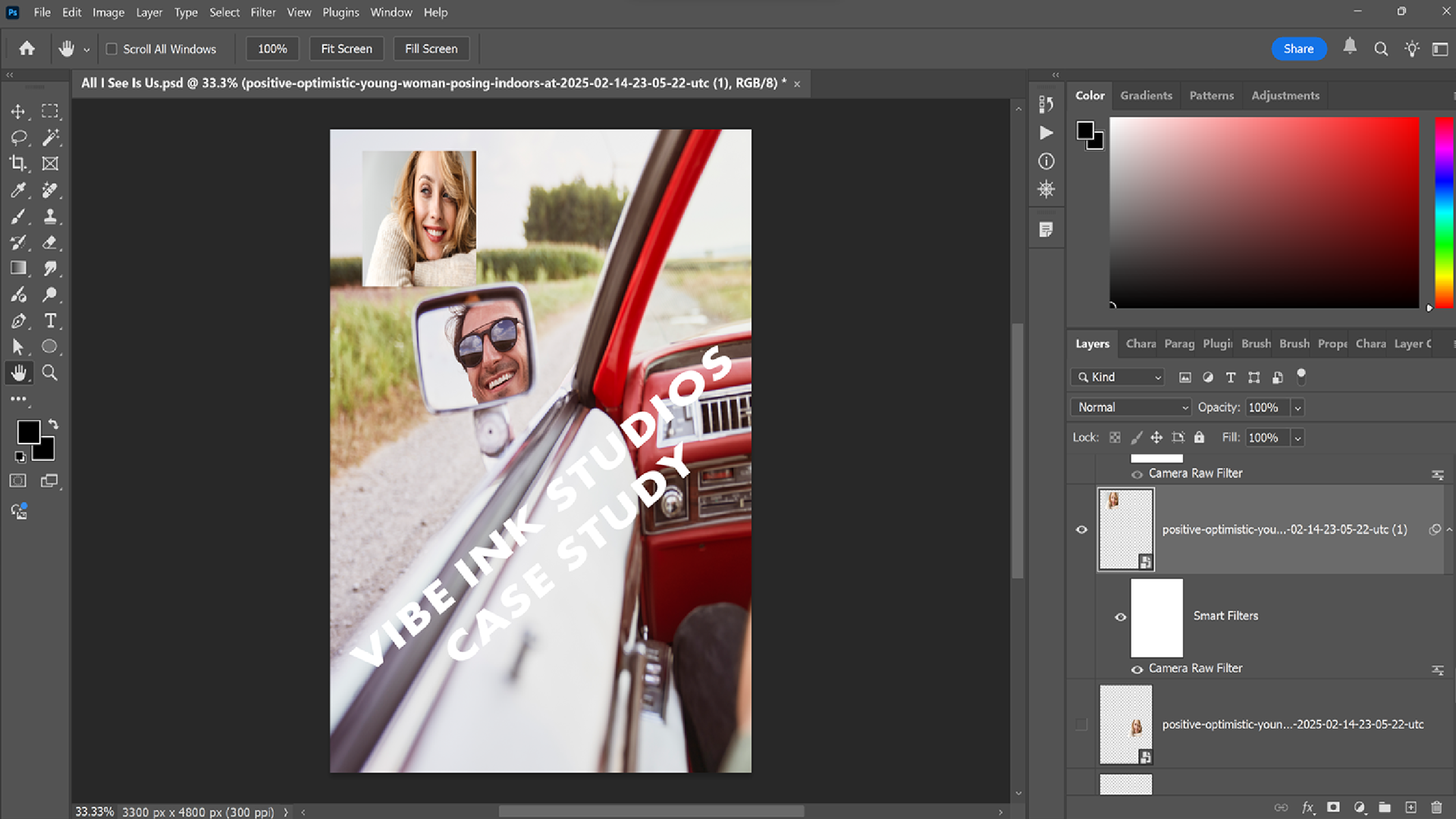
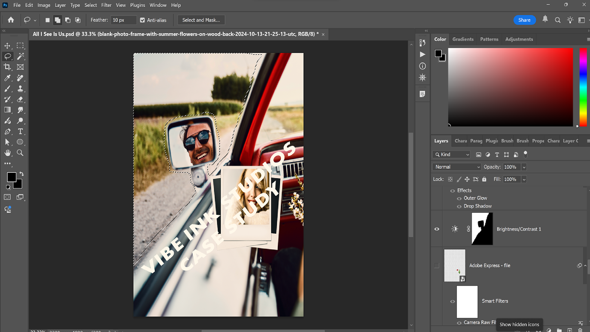
To make the woman 's image sit naturally with the poster I used camera raw filter, adjusted the brightness, contrast, texture, clarity just to give it some boost and gentle lift to the image so that it blended within the scene.
With all of the images in place, the next stage was to refine the overall balance through curves adjustments, brightness, contrast and colour grading. I also used the Lasso tool (highlighted in the image below) to carefully adjust the brightness levels on the left side of the poster, this made a significant difference, even made the interior of the car come to life.
The next step was choosing the right font for the main title, including subtitle. This part is more about picking a typeface; it's about the spacing, kerning, and alignment so the text feels integrated perfectly, including the correct colour, this is where your creativity becomes the final outcome of your concept design, the balance has to be right.
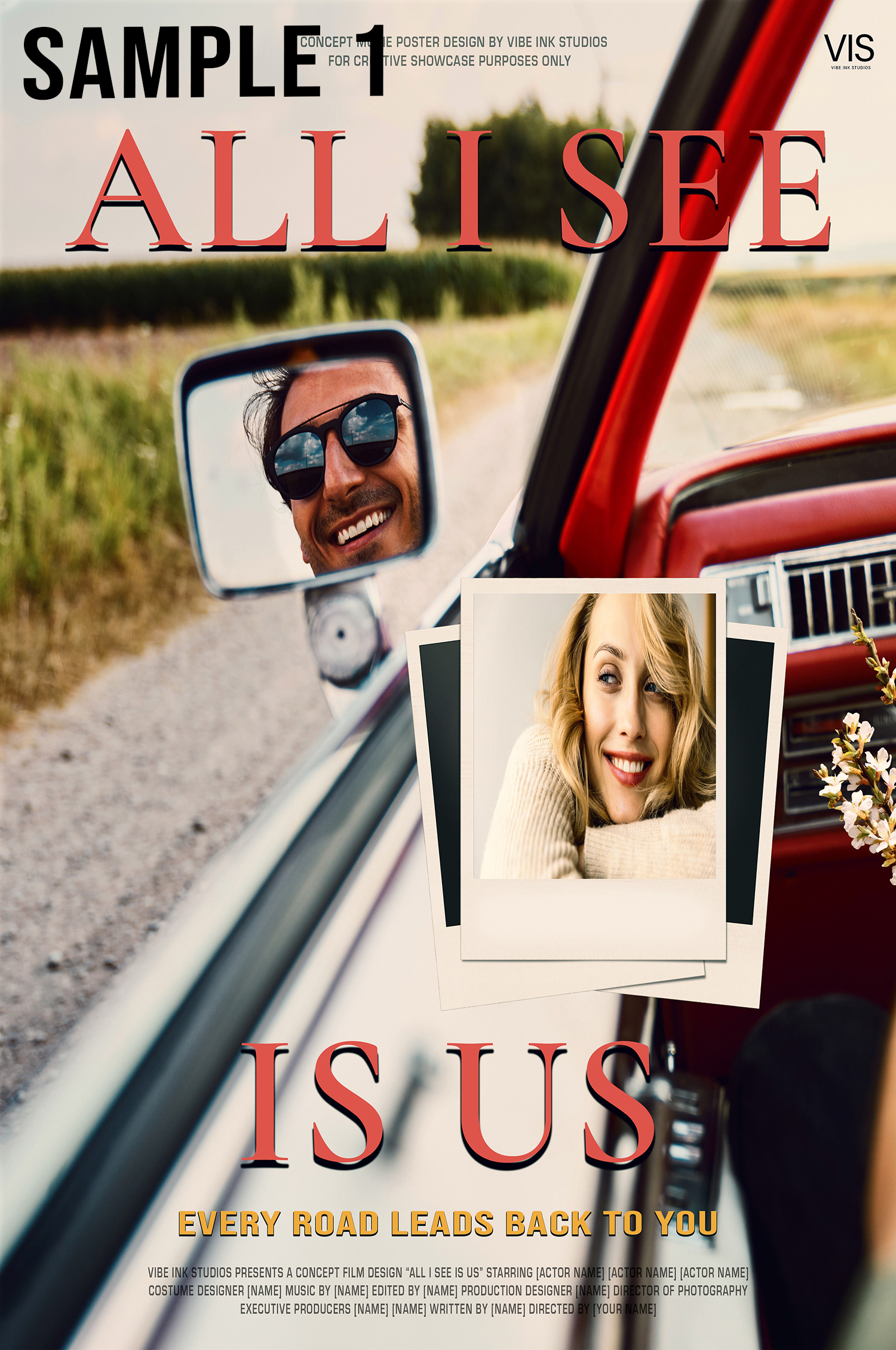
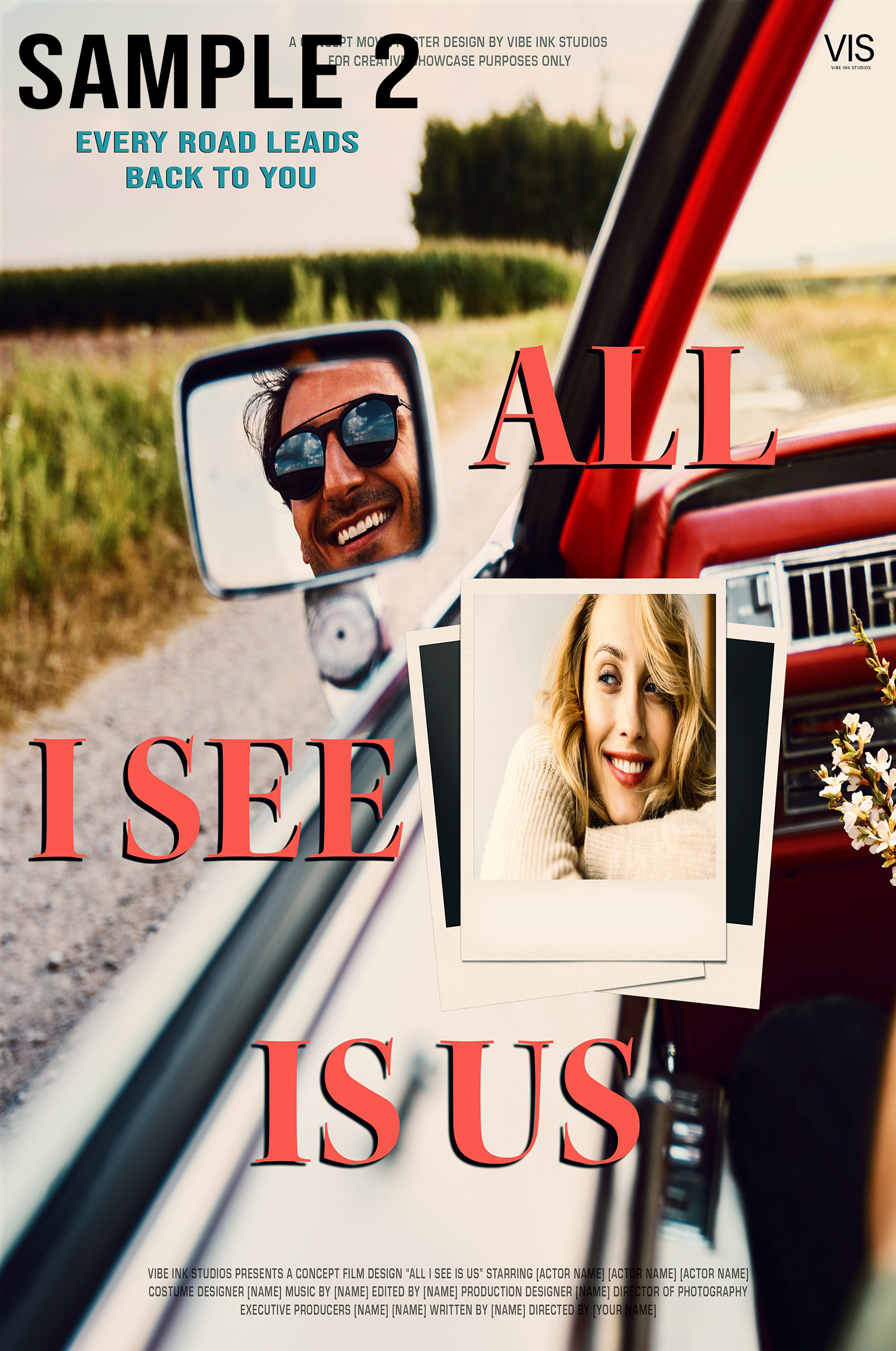
As you can see, I explored several variations for this case study and selected three samples for comparison. Notice how Sample 1 feels different to Sample 3.
Sample 3 is the clear winner, on Sample 3 I adjusted the woman's face again using camera filter, adjusted the texture, clarity, exposure and contrast, gives it a more polished look.
I also used a removal tool to clean up the arm in the bottom-right corner, it helped with the balance as it looks more cleaner. I added white highlight to the title so it stood out cleanly against the background, a smoother look for a romantic concept.
The fonts used for this poster
Main Title: Kepler Bold Display
Subtitle: Bebas Neue
Credits: Erostile
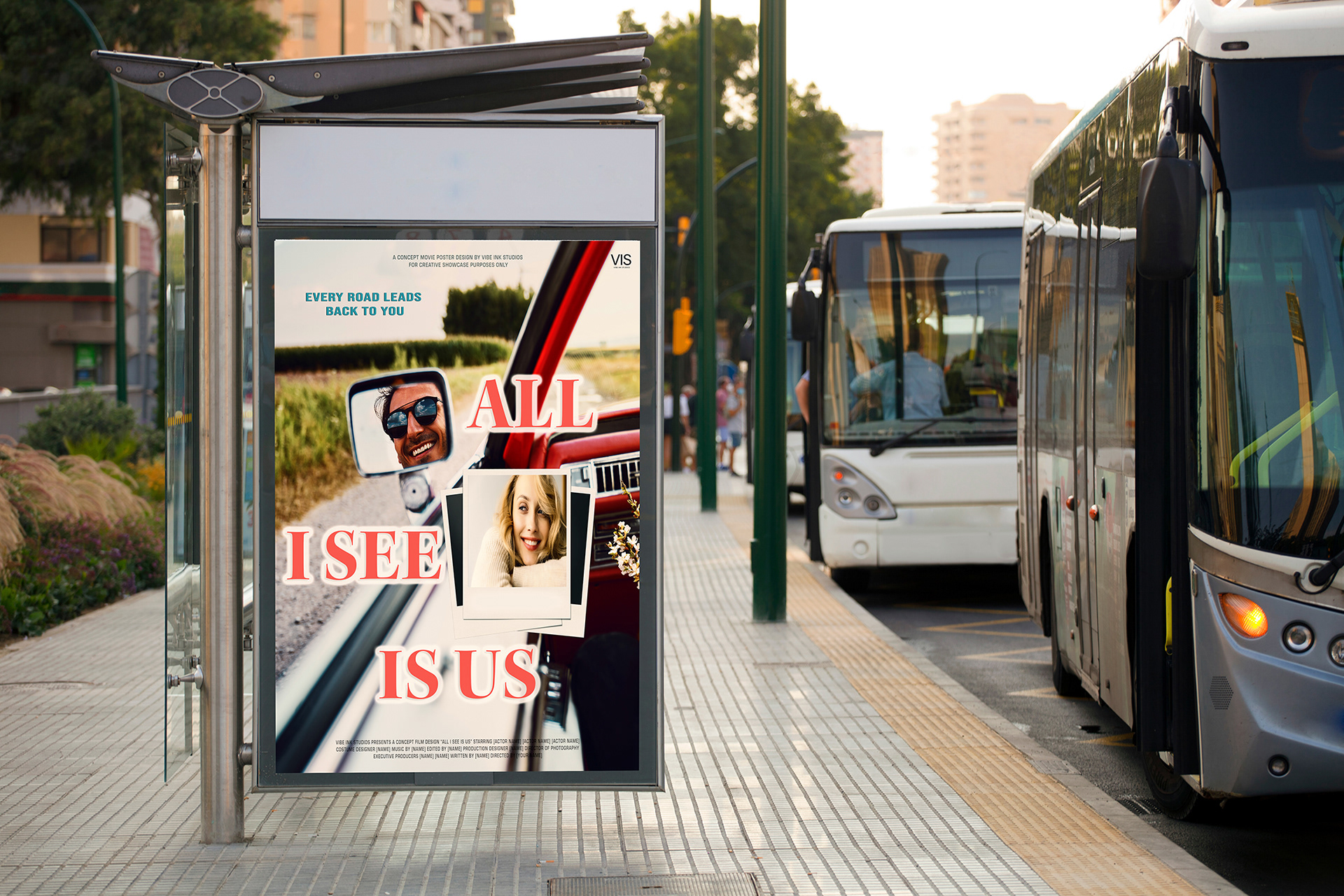
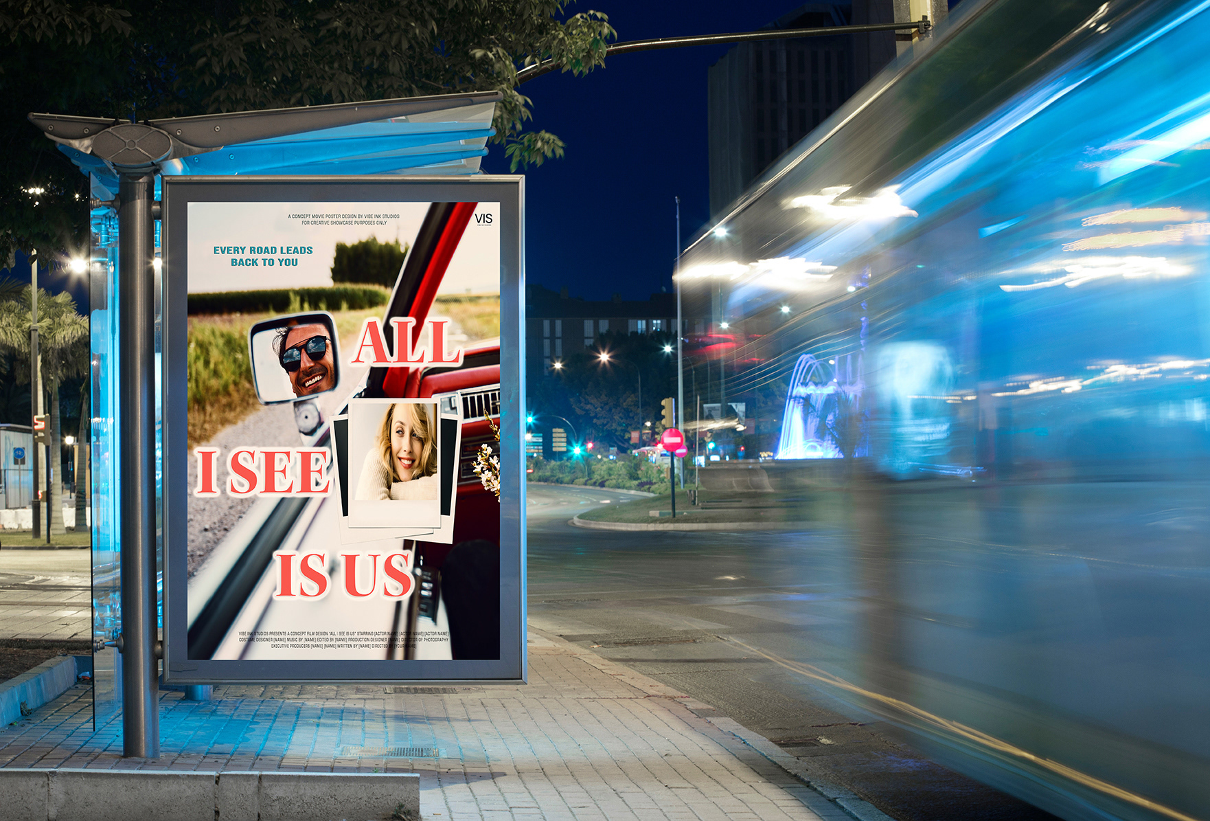
4. Mockup & Context - The final poster version including mockups of billboards
Below are mockups of the concept poster displayed on billboards and bus stops, it's exciting to see the design come to life and understand how it feels in a real world setting, impact of good font selection and colour choices of the title and subtitle make a huge difference.
5. Final Touches & Reflection
Overall, this was an exciting project, especially as it was my first time designing on a romance concept poster, I truly believe that the more you immerse yourself in projects like this, the more you will grow effectively.
What I learnt from 'All I See Is Us' was how important it was to space the images including typography, the kerning/spacing/alignment can influence the entire design of the poster, I'm happy that I have shown the emotion of story telling within the design concept and feel confident within my approach of designing narrative-driven posters.
