Steel Noir – Conceptual Movie Cover Illustration
(Disclaimer: This is a conceptual illustration, not an official movie cover.)
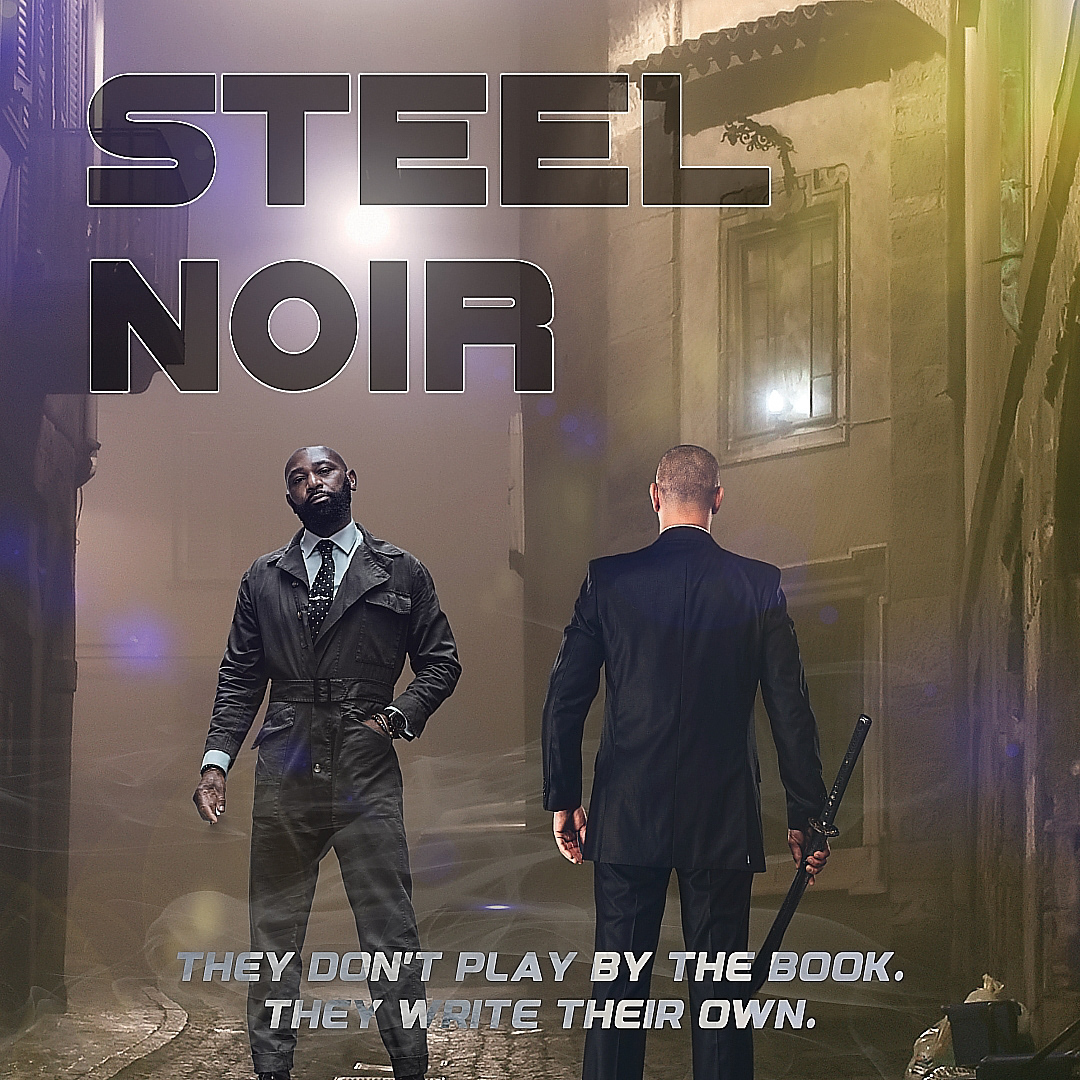
“They don’t play by the book. They write their own.”
Honestly... that line kinda just popped into my head mid-design and stuck. It felt right.
Honestly... that line kinda just popped into my head mid-design and stuck. It felt right.
Steel Noir came out of a late-night spiral where I kept thinking about alleyways, fog, and that whole classic-meets-modern noir vibe. Gritty, slick, a little dangerous but still cinematic, not messy. You know the look. It’s got attitude.
I threw everything together in Affinity layered a bunch of shots, moved pieces around obsessively, messed with light until it looked like something you'd pause a movie to stare at. The fog was a big deal. So were the shadows. I wanted depth without overloading the frame.
There are two main figures one’s facing forward, the other’s kind of turned, like they’re watching each other but not speaking. A quiet standoff. You can feel it. I didn’t want them smiling or overly posed. Just tension. Stillness with a story behind it.
The title font? Sharp. Heavy. Metallic, because that felt like it belonged. Something you'd see carved into a steel plate or scratched onto a weapon. It gave weight to the poster without yelling.
Not a real movie—just a concept piece I made because, well... I love this kind of storytelling. Through design. Through atmosphere. That moment where it feels like something happened right before, and something else is coming next.
Made it for my portfolio. Nothing commercial.
But if it resonates cool. Let’s talk.
But if it resonates cool. Let’s talk.
Designed in Affinity. Created by Vibe Ink Studios.
© 2025. All rights reserved.
Assets licensed from Envato. Final layout, style, direction—fully original.
Registered on ProtectMyWork.com.
DM or email if you're into this kind of work. I'm always game for bold ideas.

